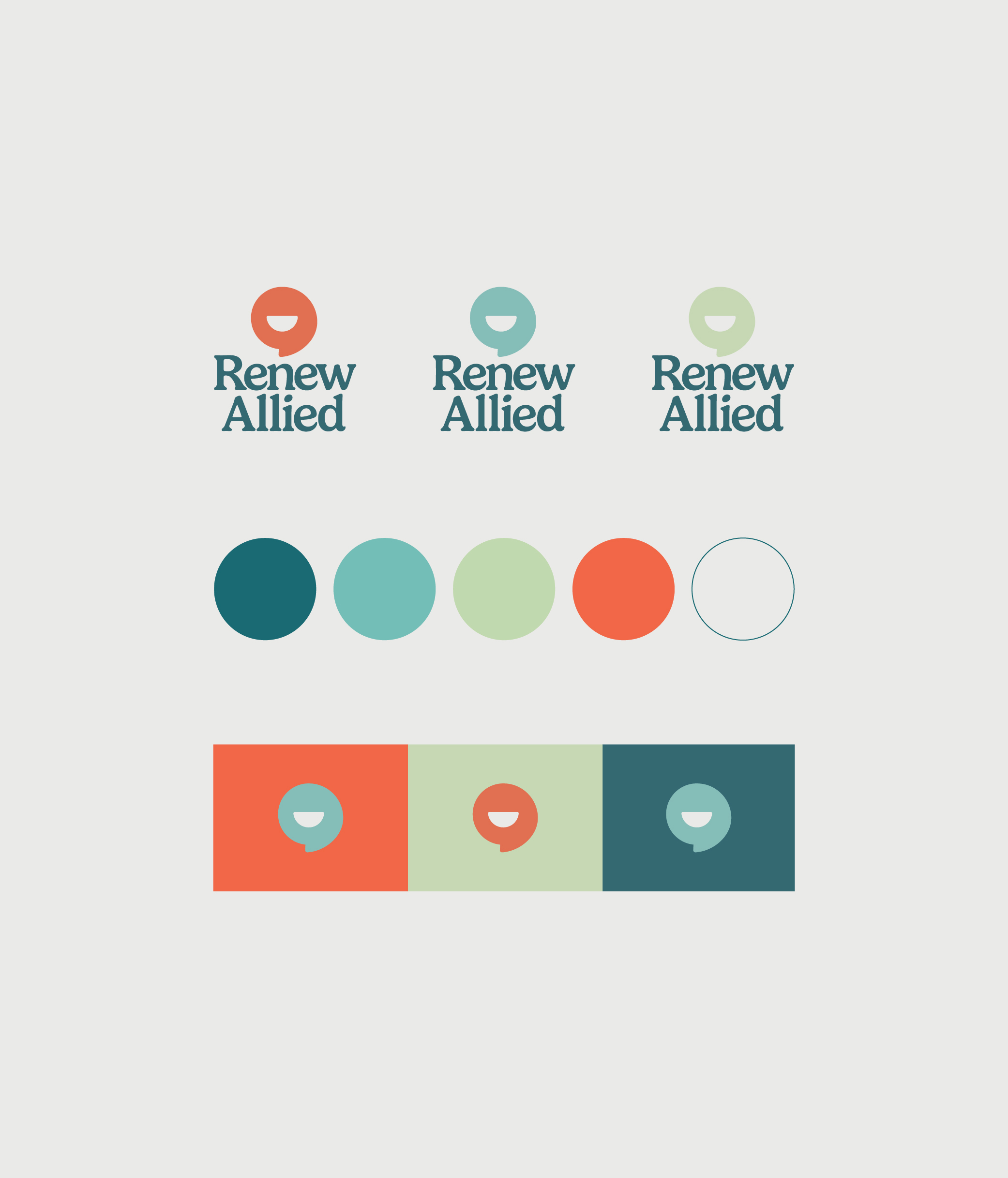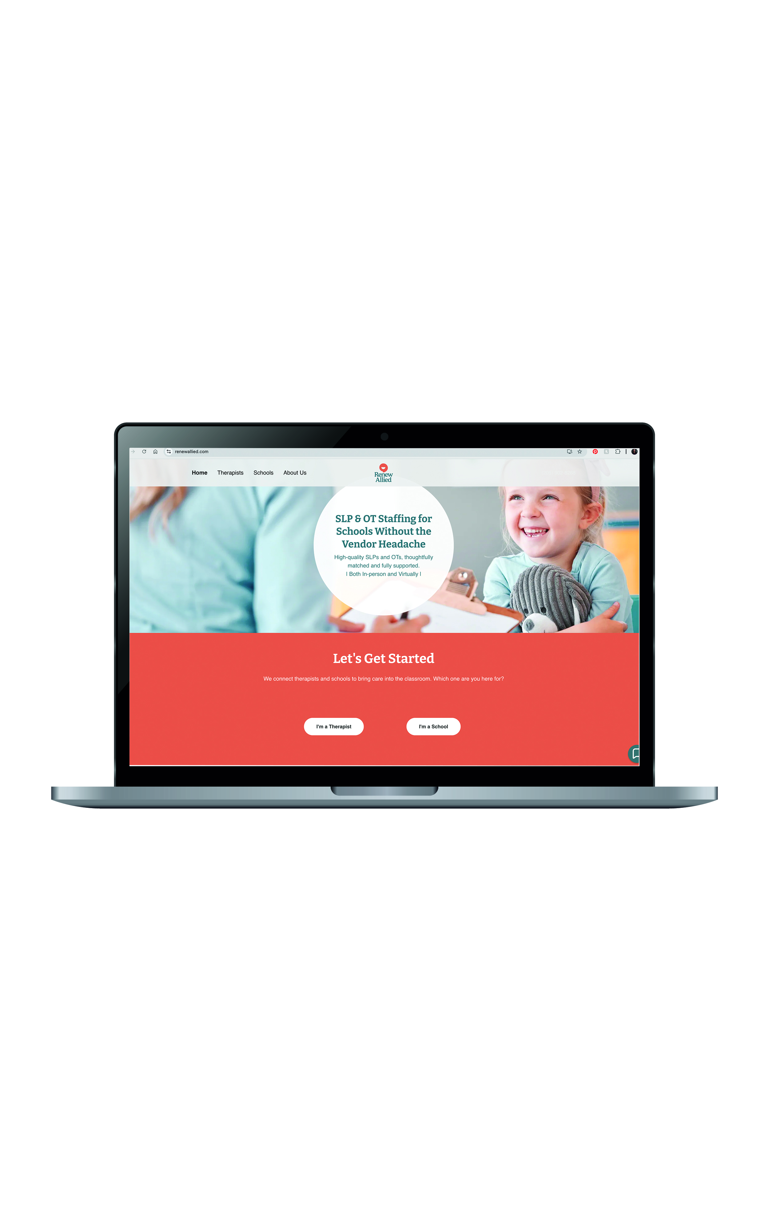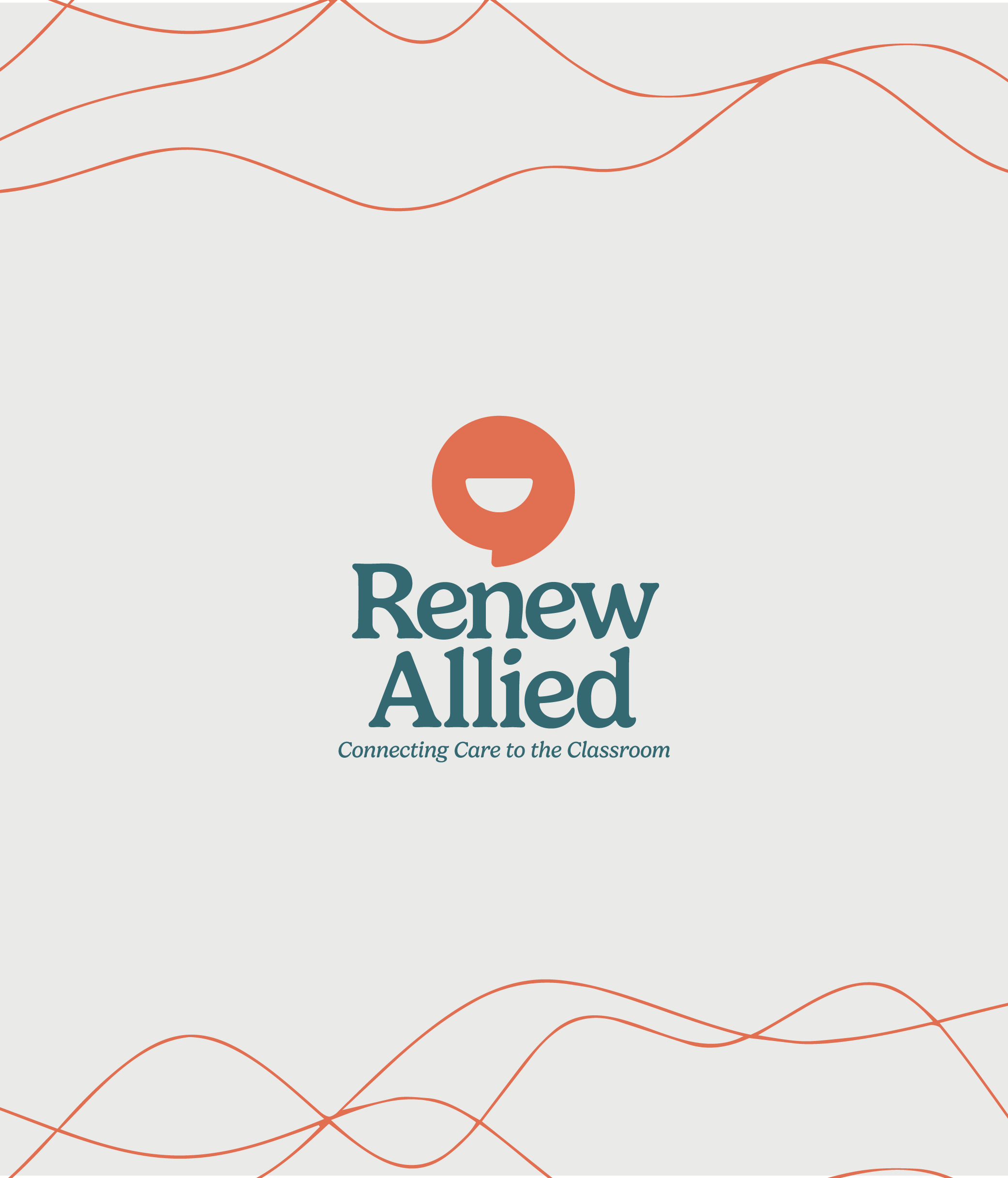
Renew Allied partnered with Panthera to evolve its existing brand into an identity that better reflected the warmth, expertise, and personality behind the business. Rather than starting over completely, Panthera built on recognizable elements of the original brand while introducing a new logo, typography, expanded color palette, and visual system. The result is a brand that feels professional and trustworthy without losing the warmth and approachability that matters to the families Renew Allied serves.
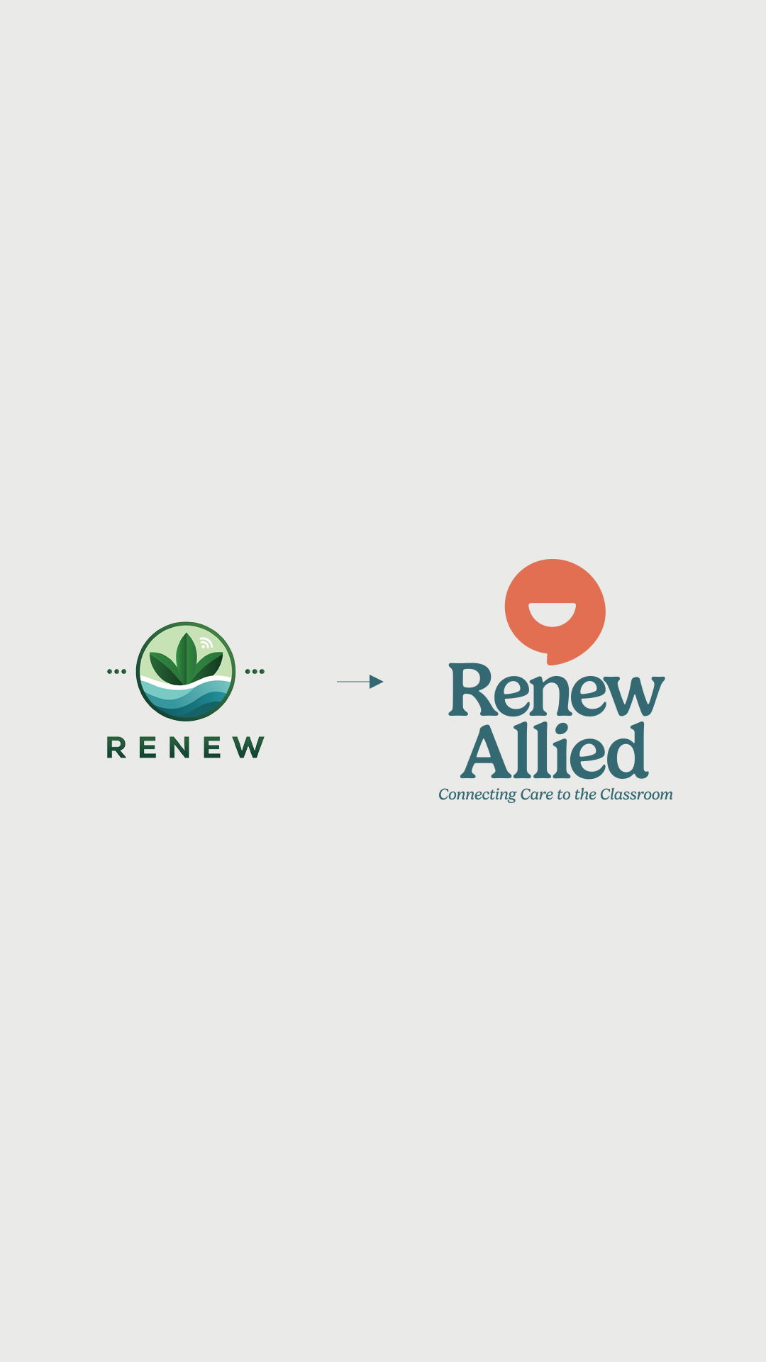
Renew Allied had outgrown its existing identity. While the brand had established a sense of renewal through its blue and green palette, the overly-detailed plant imagery felt generic and didn't clearly connect to speech and occupational therapy. The challenge was to preserve the familiarity of the existing brand while creating something more distinctive, relevant, and reflective of the experience Renew Allied provides.
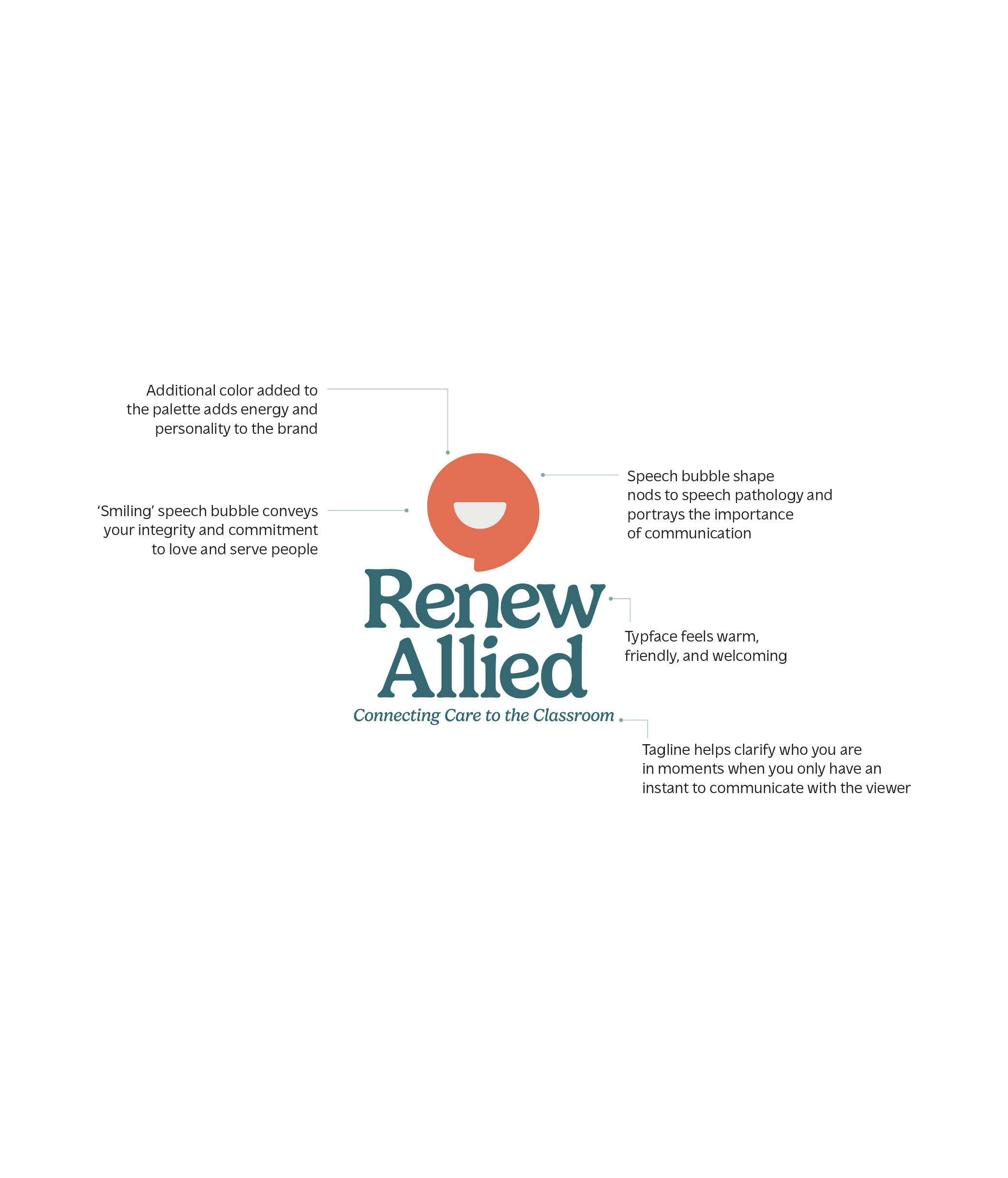
The new identity keeps Renew Allied's familiar blues and greens while introducing a pop of orange for contrast, energy, and playfulness. A rounded serif font brings personality and softness to the typography while maintaining a professional feel. The biggest shift is the new logo mark: a smiling speech bubble that creates an immediate connection to communication while giving the brand a friendly, memorable character. Together, these elements create an identity that feels credible and established, but never clinical, generic, or stuffy.